The Grain Shed, through the cultivation of ancient grains and the revival of older, slower techniques, is creating deeper connections in their neighborhood. They sought out Treatment to translate their story and aesthetic into branding, website, content, and package design.
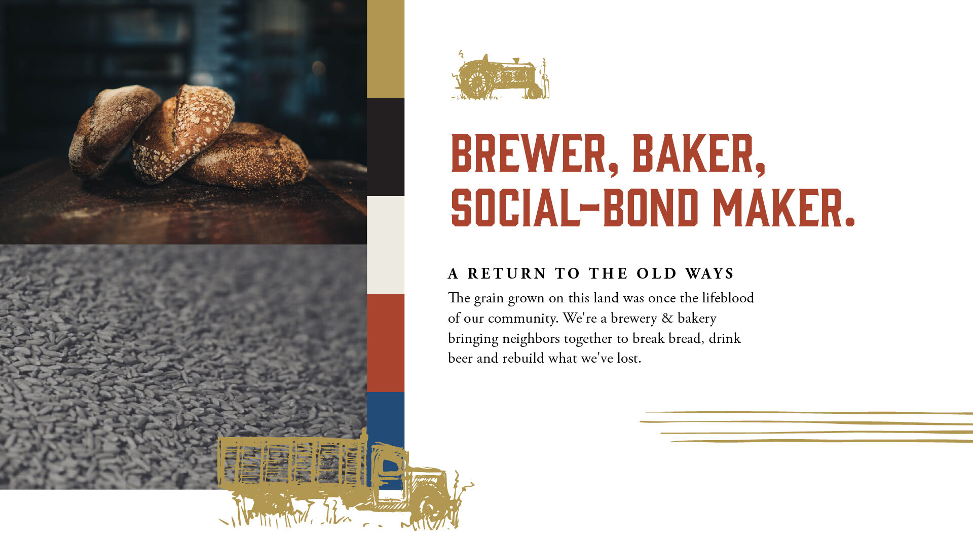
So a baker, a brewer, and a farmer walk into a bar… the result: a co-op called the Grain Shed.
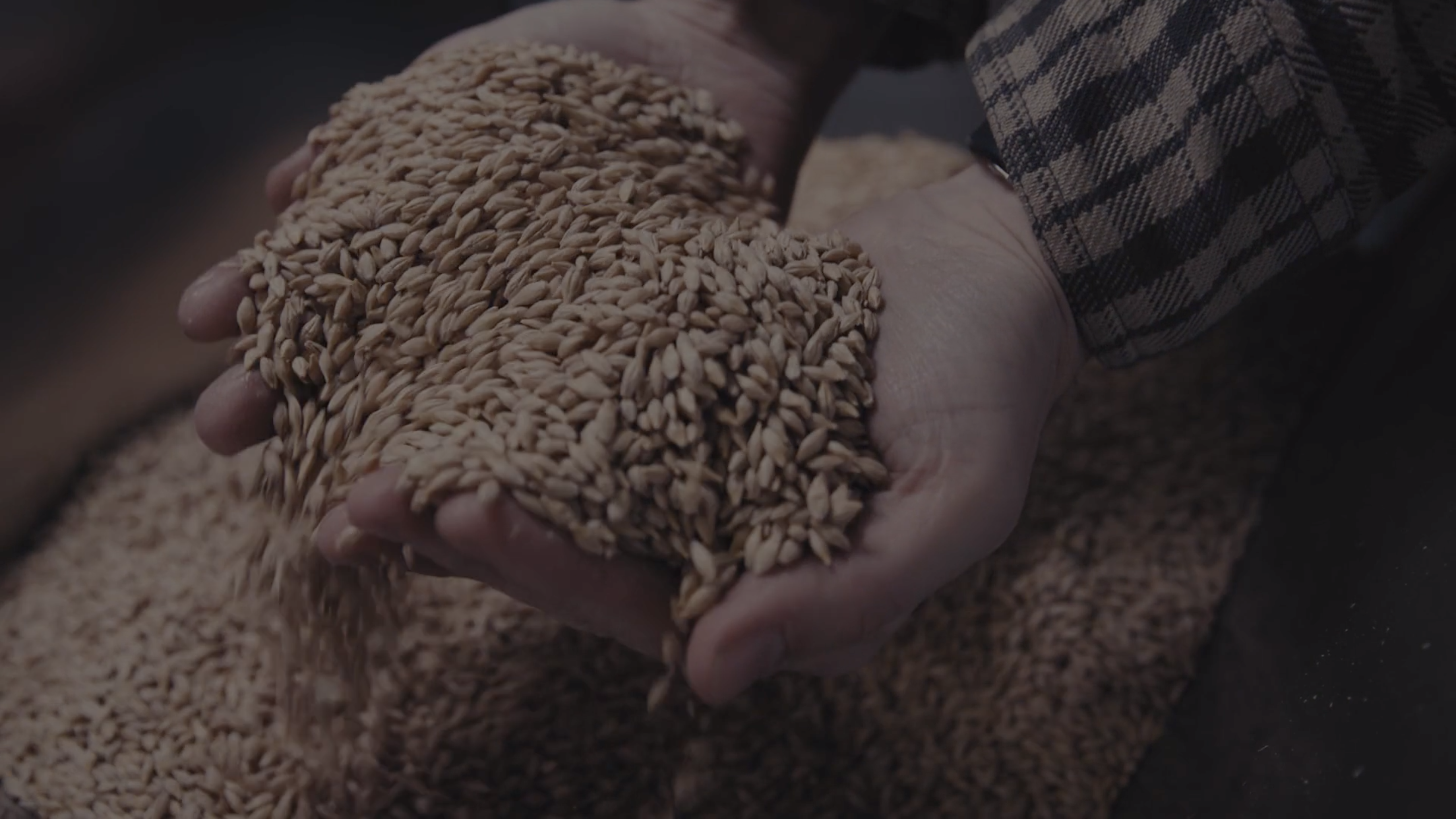
To the founders of the Grain Shed, process is everything. As the business came together, we gathered beautiful, textural video and photography of Grain Shed products — and even the Grain Shed itself — being crafted in these old, labor-intensive ways.
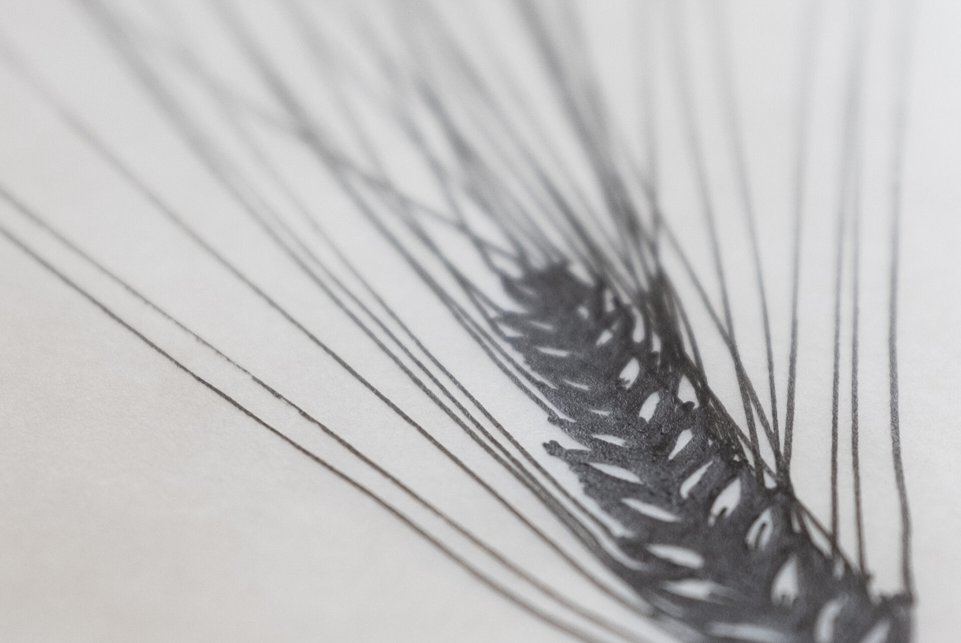
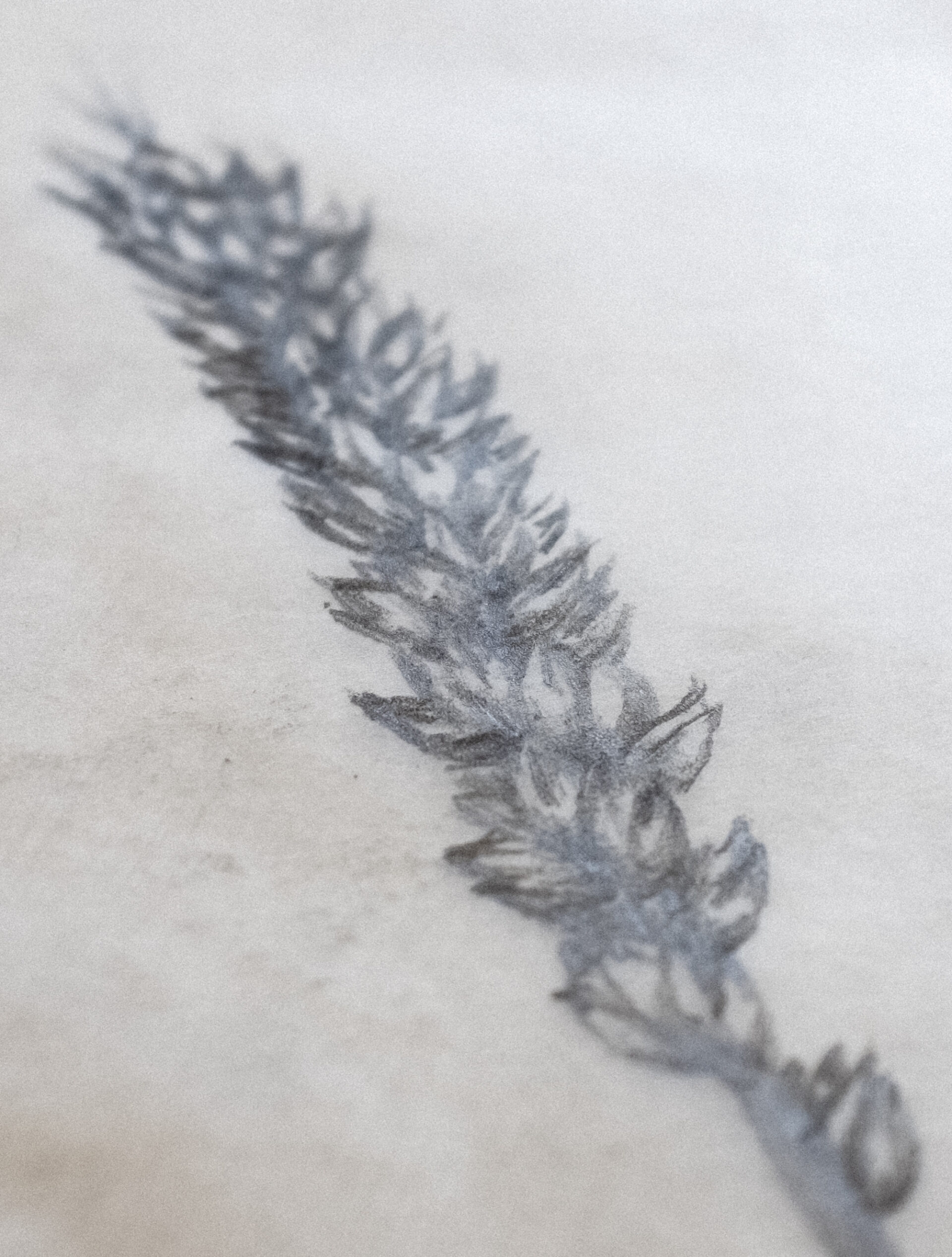
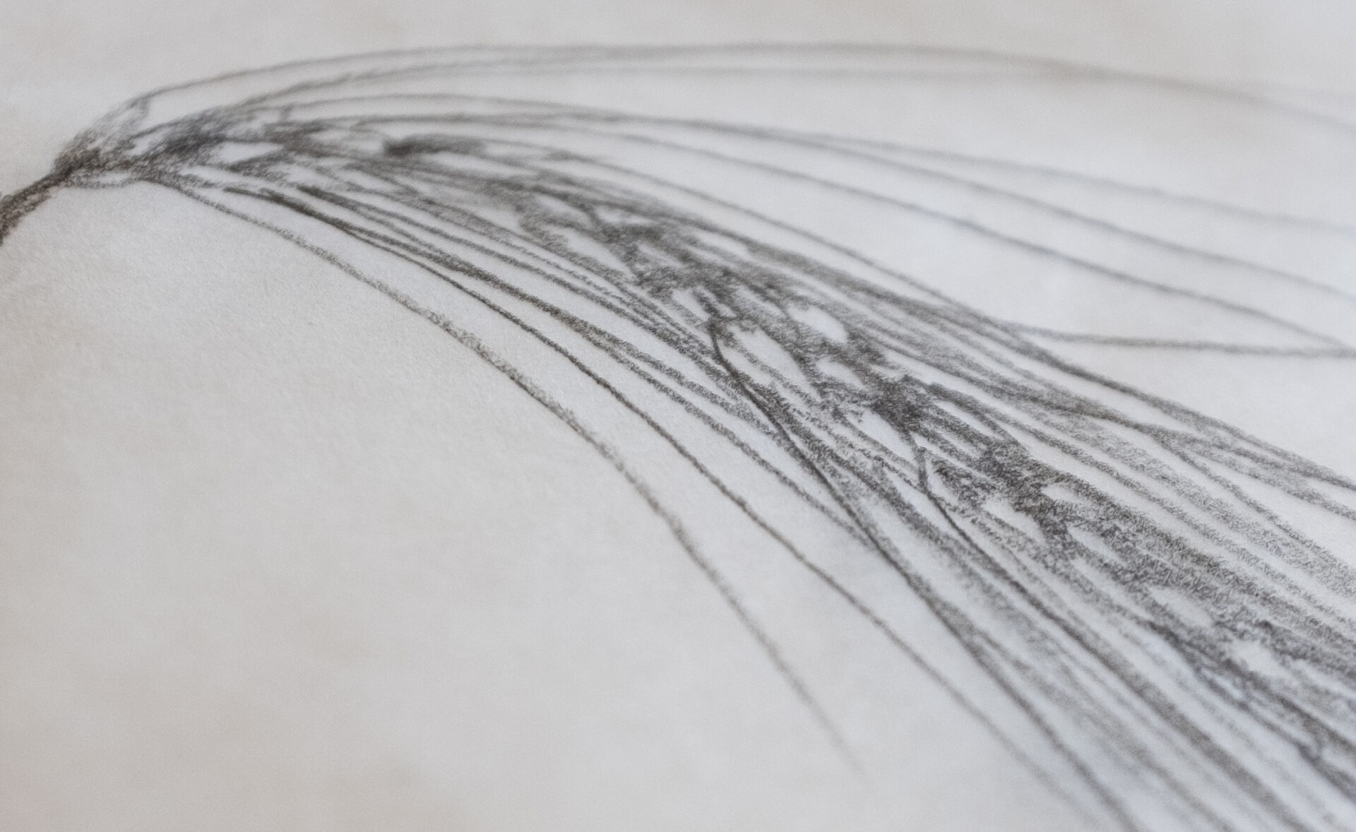
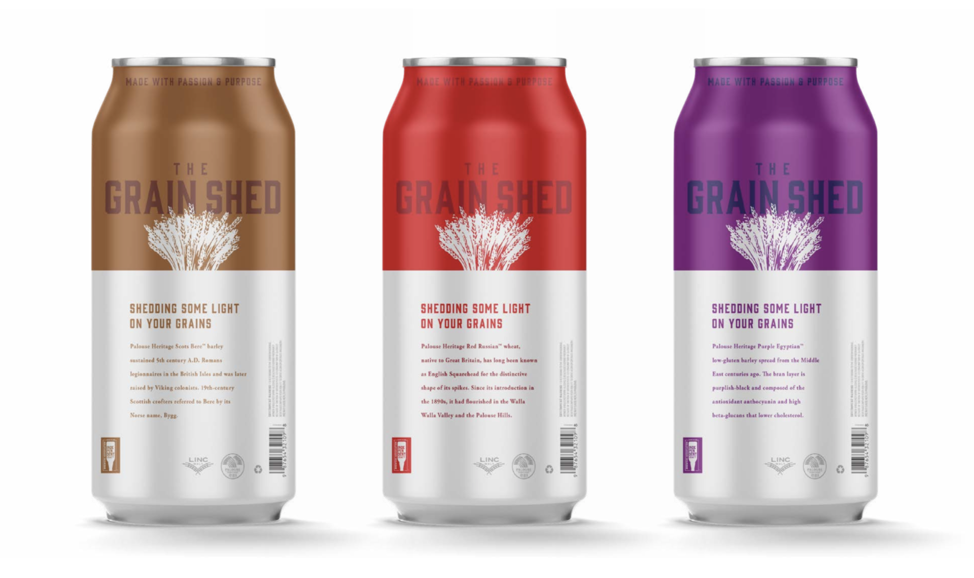
For the logo, we drew inspiration from old sketches, woodcuts, and flour bag designs. Every product of the Grain Shed is inspired by the crop itself and the fertile growing region that surrounds Spokane. What better symbol of the grains, their abundance in this area, and the nostalgia surrounding old techniques than the timeless depiction of a bundle of grain?
From there we built a complete visual system that brings photo and video together with rustic illustrations and colors reminiscent of old tractors, trucks, and golden grains.
We then took those assets and combined them into a simple, elegant website with thoughtful brand language that articulates their vision and offerings.
Visit thegrainshed.coop.
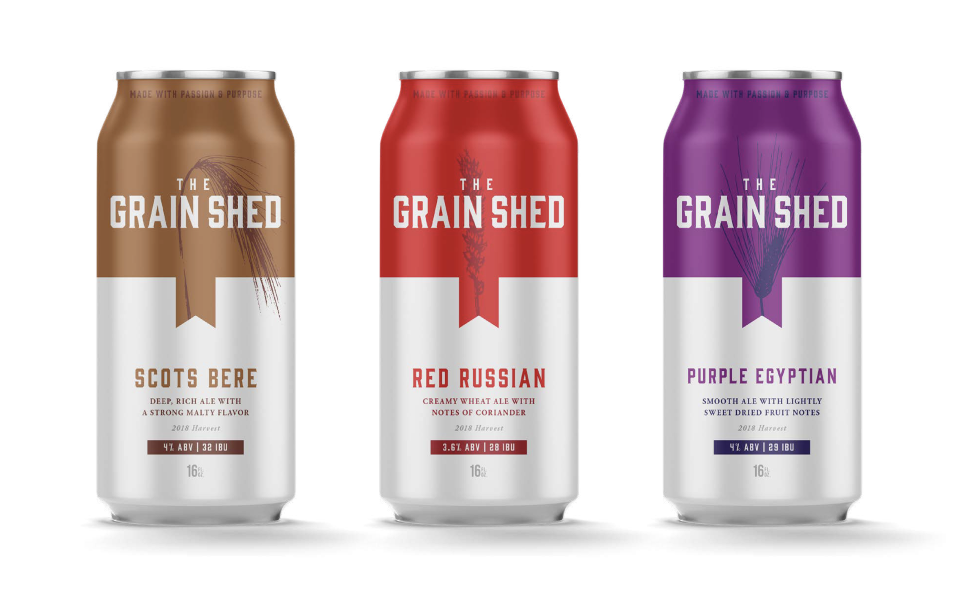
Later, we took the brand and applied it to beer cans. Each beer the Grain Shed brews is crafted to feature the flavor of a specific local grain variety, so each can features a unique illustration of the grain variety used.