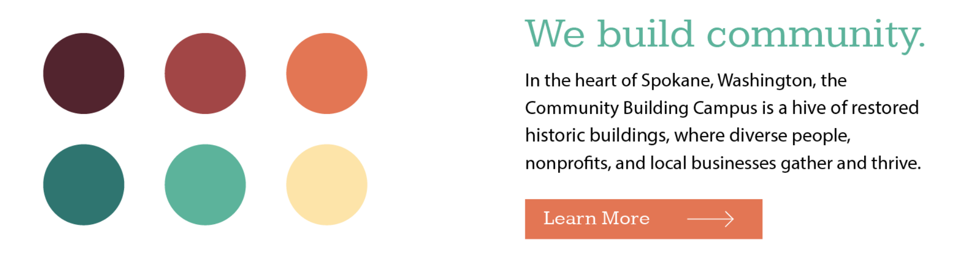
The Community Building campus is a block of restored historic buildings, where diverse people, nonprofits, and local businesses gather and thrive. Treatment created a web experience to articulate their vision and allow a variety of users to explore the many facets of what they’re up to.
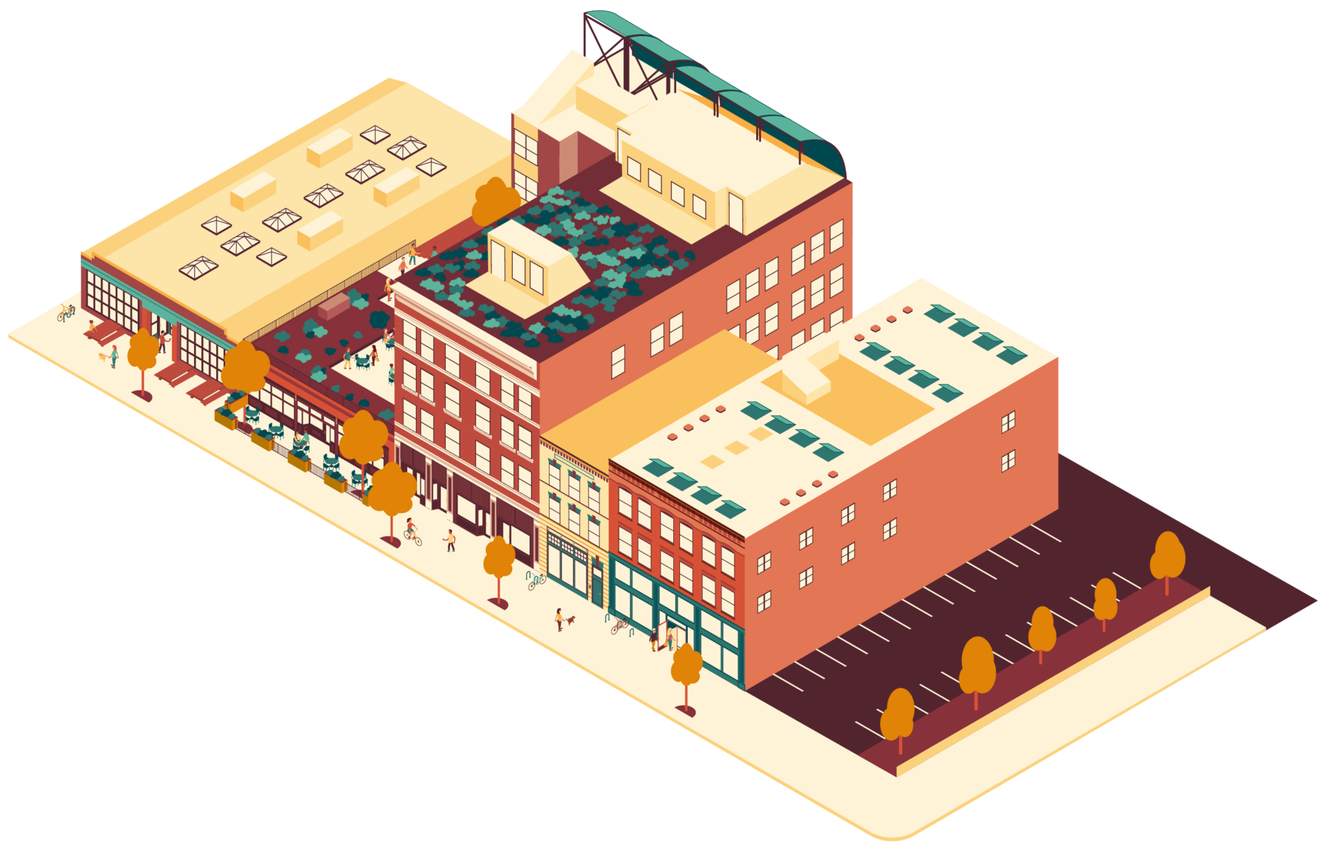
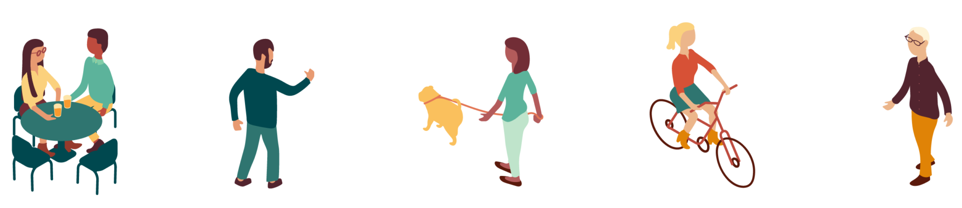
A lot is going on at the Community Building, from curating a community of like-minded tenants to leading the way in green development. With real estate as their primary tool, they are building a vibrant, prospering community that seeks justice. Our visual goals for their website flowed from that: to communicate the place and the culture it yields. The best way to communicate those things was through the use of brightly-colored isometric illustrations, showing off their campus, its green features, and its diverse community.
While the client wanted to keep their current logo, we expanded on the visual identity, creating a vibrant color palette that played off of the campus' brick tones and adding a playful slab serif font for headlines.
We created a content strategy for the site that directed a variety of audiences to easily get to the bottom of what's going on at the Community Building campus. For shoppers, we created a directory of public-facing businesses. For those curious about the whole ecosystem, we created full, filterable directory of all the businesses there. For those who want to learn more about the mission and possibly create a similar project in their city, we left room for them to go deeper in the "about" section without overwhelming users with content.
View the Community Building website.
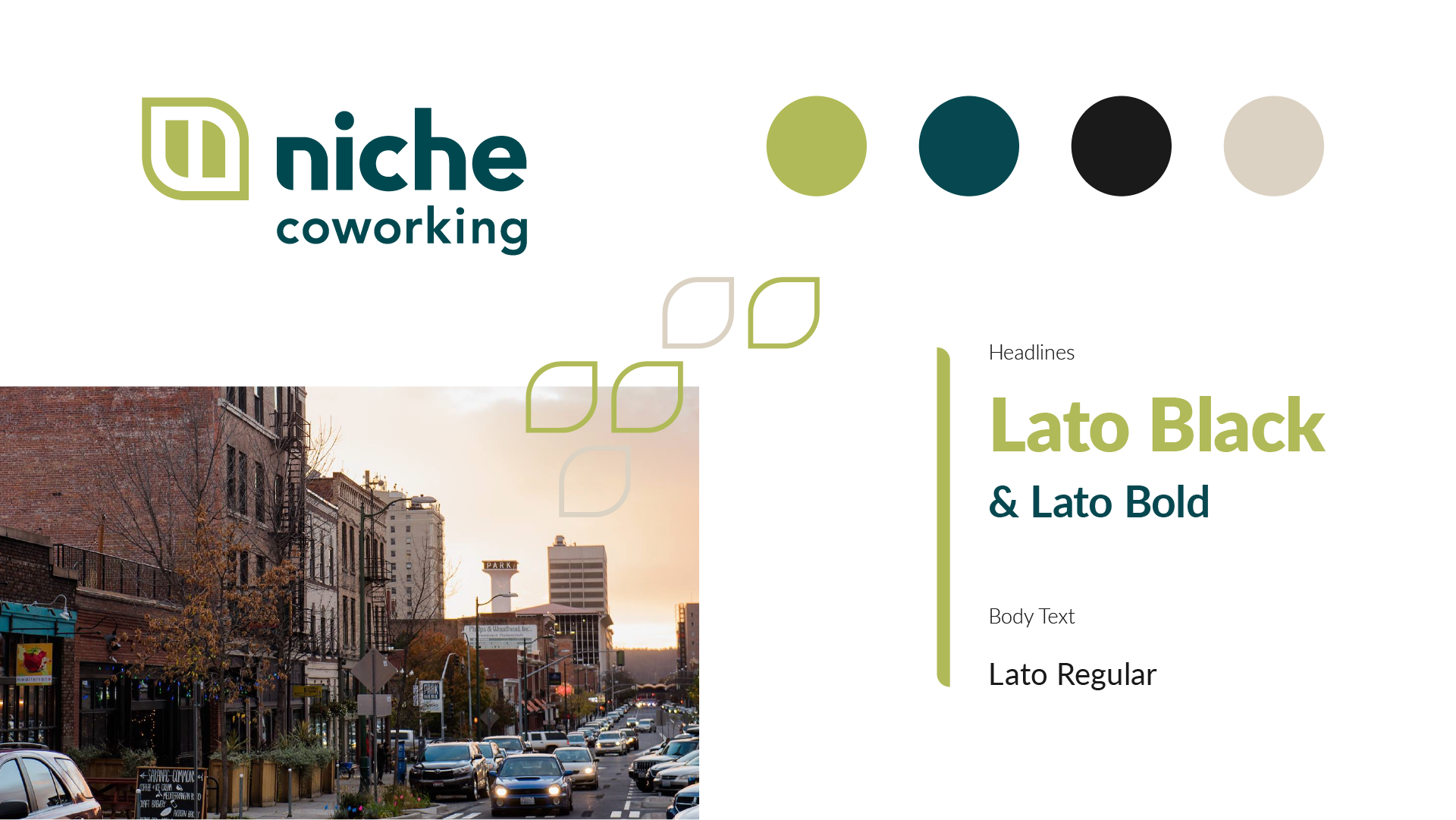
In tandem with the main site, we also developed a brand and web page for their coworking space, Niche.
View the Niche Coworking web page.
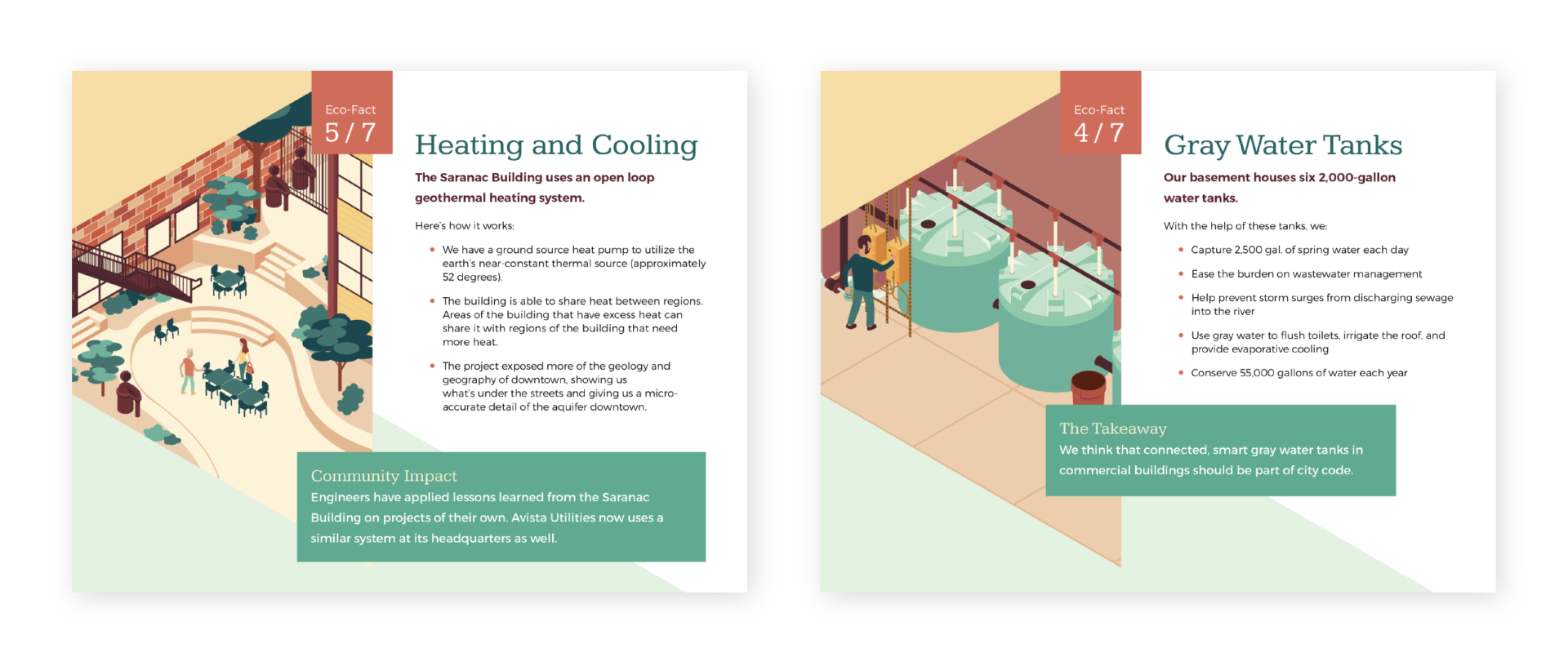
Following the web project, the Community Building also wanted to find a way to share their buildings' green features through printed signage posted around the campus.